woes of navigation
15 Jun 2026 - digitalily
I would like to begin by stating that I am not a UX designer. I did technically take a very phoned in UI design course in college, but it was only dubiously useful and mostly boiled down to 'talk with the client.' Which, all things considered is a really good piece of advice, but also is something that clearly a lot of large tech companies seem to stomp all over in favor of their own ideas of streamlined, or worse, maximizing dark patterns. Fortunately on this website, the stakes are a lot lower, and it mostly comes down to my own preference in combination with the degree to which I want to go. Starting from a fairly basic starting layout and being a static website with limited javascript at the moment means larger changes are simpler (except when confusing css is involved), but how exactly I achieve my goals can be a bit constrained. Here, we'll be talking a bit about what I call the horizontal navigation bar.
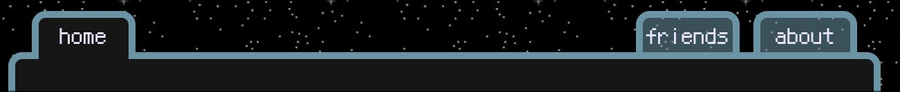 this thing
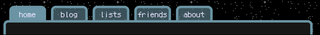 what it was before
This journey began when I began brainstorming adding a new 'main area' for projects (which, as of writing is still a ways off, but still). When I added the area to my page listing to see how it would currently render, I ran into two main problems:
- while 'friends' fit nicely, 'projects' was slightly too long to fit the current tab size
- space is at a huge premium
Both these problems intertwine a good deal, and mostly because for some reason I have decided to make this site (in the biggest air quotes possible) 'mobile friendly.' On my phone, the previous layout took up essentially the entirety of the width they were provided, with the text starting to bleed out the borders. I didn't want to restrict myself to 5 tabs ever, even with the ability to have dropdowns under them, as not every page I may want is as simple as a list of things.
Initially I was thinking to move the buttons to the currently unused right side of the main area, descending from top to bottom. However with this, I was concerned about reducing the width for content even further, and ultimately it came down to an aesthetic reasoning. I found that I quite like the 'bump' of the tabs above the main content area, filling out the gap between that row of the grid and the header, especially with the sidebar not having it. Additionally, I like the illusion of the main content area being a tabbed folder, which while it could also be done on the side, I think would end up being a bit more awkward because of how wide they would need to be (vertical names are a definite no here). Having this kind of navigation towards the top makes more sense to me as well.
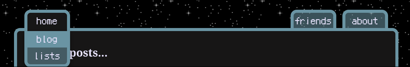 dropdown
What I ultimately settled on was what you see in the first image, and hopefully matching what you see above, assuming I haven't totally redesigned it. I decided to change how I was currently using the (poorly constructed) dropdown system that the 'lists' tab had been using, to instead have it only used on the first tab, and have the first tab represent the 'main area' you were currently on, with the others linked in the dropdown itself. 'home,' 'blog,' and 'lists' became the main areas ('projects' to follow some day), and the rest of the pages were grouped under them. For 'lists,' not much changed as it already had 'games' and 'songs,' but 'home' gained 'friends' and 'about' as subpages, as they didn't really warrant 'main area'ship and felt like they would fit among what is a generalist kind of tab. With 'blog' becoming a main area, I now saw the opportunity to add in a base page for post tags, though I'm not sure what else would fit there, which is fine. 'lists' is in a sort of awkward position because there was no root 'lists' page before, it was only a means to get to the dropdown for the actual pages, so at present it is a very barebones under construction page while I figure out what I want to do with it. Probably some kind of 'top x of y' kind of thing? We'll see.
The dropdown itself was kind of nightmarish to adapt to this, mainly because the original architecture assumed that the button which is hovered over to reveal it, would never be a link itself. This combined with less than stellar layout + a very confusing mess of css (that I aim to break out and document better at a future point) made for a challenge. I ultimately ended up looking around for some stripped down examples of this kind of thing, played around in w3schools html playground and ended up adapting the existing code to that, which made things much cleaner. The navbar's layout itself also has a hefty Liquid syntax to set up everything properly. There are likely better ways I could have arranged the data file it reads from, but I appreciate the way in which it ends up being dynamic.
I'm fairly satisfied with where this ended up, and though I expressed how I'm not keen on adding things to the right space for fear of what it will do to the mobile view, it is something I'm thinking about. With nav buttons like this, I think the issues are unavoidable, but with another block of something, it'll probably just end up stacking like the sidebar does. This is the first post discussing any of what goes into this website, and I hope it is at least a little interesting. When I ultimately have a projects page setup, the website itself will be one of the projects included there, so I do hope to continue to write more as I go on. I don't think everything will get a post, I just want to document some of it.
That's all for now- 'til next time!